9 Incredible FAQ Page Examples That Keep Customers Informed

Humans are full of questions, big and small. It’s how we find our way to the best possible decisions.
Buying stuff requires lots of little decisions, which themselves are informed by lots of little answered questions.
It makes sense then that the stores that do the best job answering the questions are the stores that reap the rewards.
If your shoppers can’t find the answers they need from you, it’s pretty easy for them to just go somewhere else. You don’t want that.
So, you create a page on your store dedicated to answering the questions your customers most commonly ask, and you call it something like ‘Frequently Asked Questions’ so it’s obvious to visitors where the answers lay.
In this post, we’ll briefly talk about why you need this page then go straight into some enviable examples of FAQ pages in action.
Some brands are just doing it really well, and you gotta see them.
Table of Contents
First, the why.
#cta-visual-pb#<cta-title>Want to customize your Shopify FAQ page?<cta-title>Create a totally custom FAQ page completely code-free and with the help of AI Text and AI Designer in Shogun Page Builder.Start building for free
Why FAQ pages are essential for your store
Your FAQ page is a testament to how well you understand your customer base.
It shows that you did the research on what their frequently asked questions are and set out to answer them in full.
Some FAQ pages will contain just a handful of questions because that’s all that was needed. Others may have dozens of questions. It entirely depends on the brand and product.
Typical areas of interest for FAQ pages are shipping and return policies, product materials, sustainability, payment methods, etc.
The benefits of a great FAQ page are many. A few stand out:
- They decrease the burden on customer service by answering questions before they get that far.
- They build trust with your shoppers by showing you understand their needs and concerns.
- They help boost your SEO efforts by explicitly asking and answering questions that your shoppers might search on Google and other search engines.
In another post, we covered some of the best practices for your FAQ pages, including categorization, a search function, great design, clever use of internal linking, regularly updating your page, and more.
Plus, we laid out exactly how to create an FAQ page on your Shopify store, both from scratch and by using some Page Builder FAQ page templates.
How Shopify designs their FAQ page
Speaking of Shopify, let’s look at their pretty stellar FAQ page before we move on to our ecommerce examples.
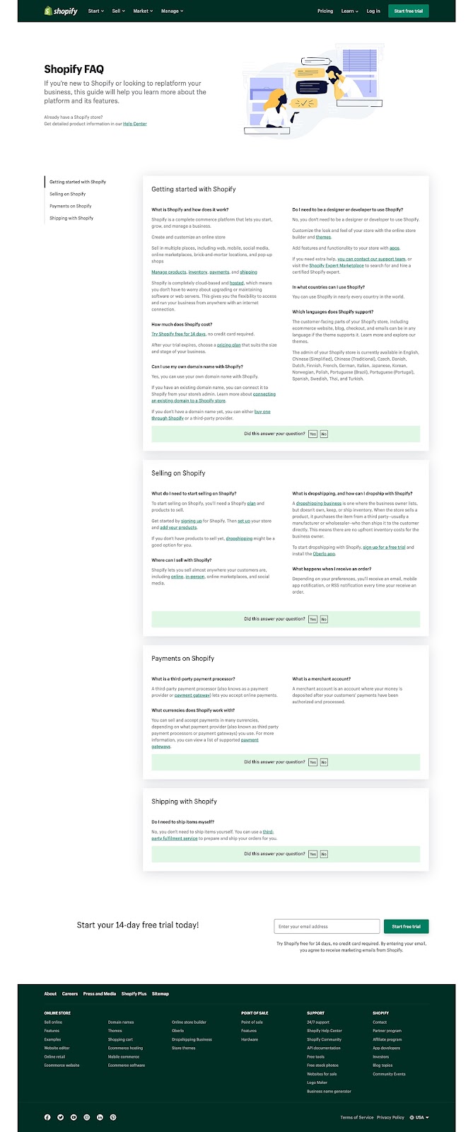
You knew before you saw it that it would be good. They are a company at the top of their game. But, what is it that this page does so well?
- Categorization. They make everything easy to find with clear categories that represent the biggest stages in their customers’ journey.
- Scrollable table of contents. Supporting the categories is a TOC that moves as you scroll, so you can also get to another category in a flash.
- Internal linking. The answers are quick but provide links out to larger resources on the site and makes it easy for visitors to find exactly what they need. Plus, it’s great for SEO.
- Great design. With a great illustration at the top, defined boxes for the categories, and splashes of on-brand color, the page is a great experience for visitors.
- Lead capture. At the bottom of the page, they make it easy to sign up with just an email capture.
- Optimized for search. The questions and their short answers are perfectly built for ranking on search engines for these same queries.
Think about these features as we look at some examples from ecommerce brands and as you build your own FAQ page.
#cta-visual-pb#<cta-title>Start building your FAQ page smarter<cta-title>Create a totally custom FAQ page in just a few clicks using the Shogun Page Builder—completely code-free and with the help of generative AI.Start building for free
9 FAQ page examples from top ecommerce brands
While you can learn a lot from how all types of brands build their FAQ pages, it’s best to look at the businesses that most closely match your own.
So, here we’ll look at a variety of ecommerce brands from several different industries to see what they did so well.
Snug Sofa
This FAQ page from Snug is excellent.
They stay on brand with subtle splashes of color on the tabs and CTAs that match the header and footer.
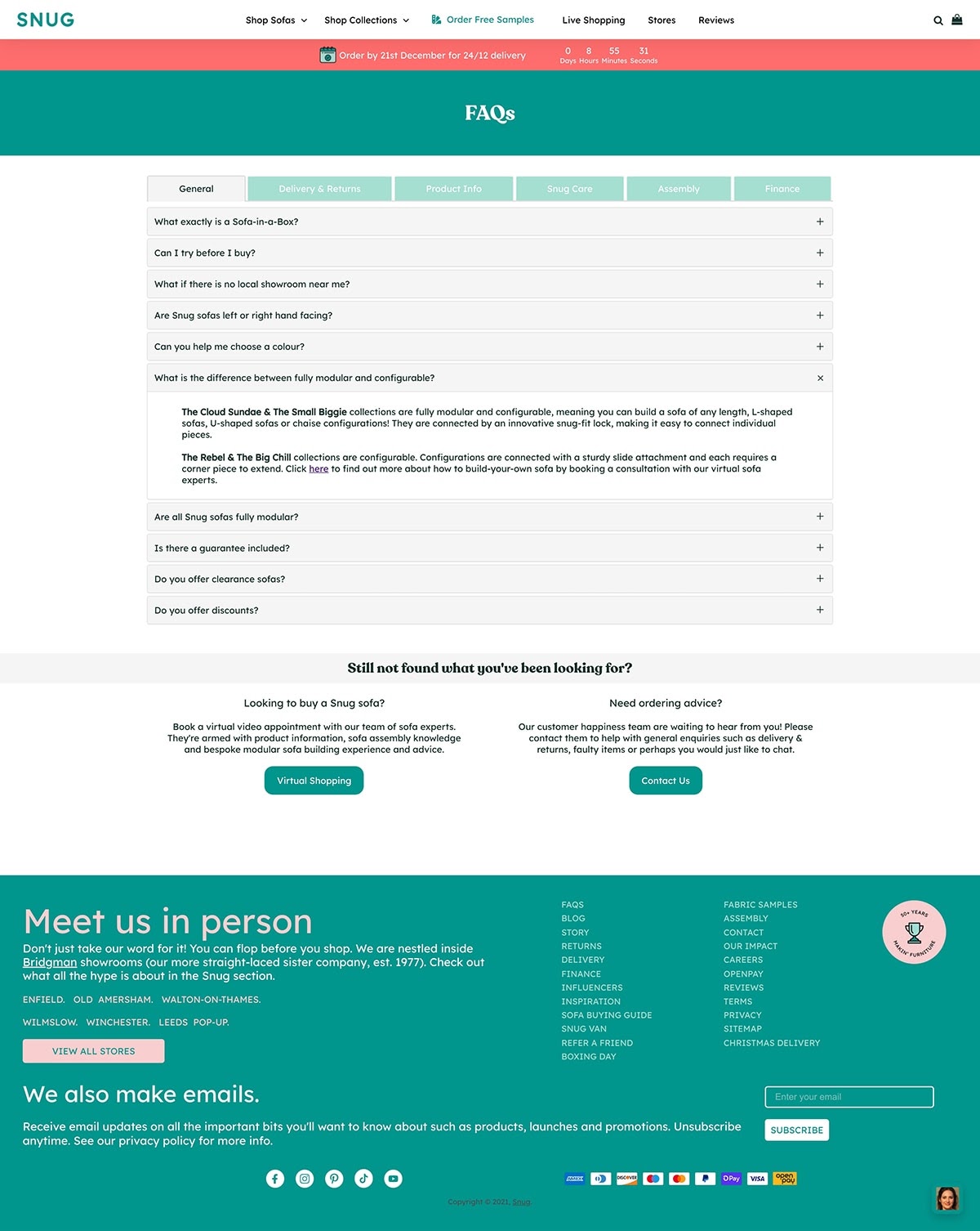
The page is short, but it packs in a lot of information. This is accomplished through the clever dual use of tabs and accordions, so that content can be condensed both horizontally for categories and vertically for questions.
It ends with two side-by-side CTAs—one for scheduling an appointment for virtual shopping and the other for contacting support for any unanswered questions.
whind
Brands are the best at knowing the questions that are at the top of their customers’ minds.
Sometimes simple is best. This FAQ page from skincare brand whind shows that you can answer questions without stating them outright.
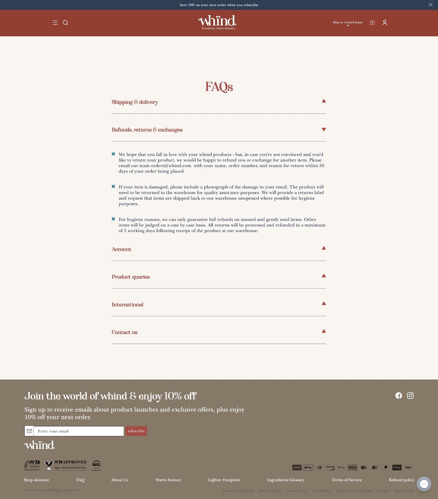
By invoking the high-level categories and answering in bullet points, they check all the boxes and finish up with ways to contact them if you still have questions.
In fact, they give multiple ways to contact them (two email addresses, live chat, and Instagram DM) throughout the page, giving customers the feeling that they are well supported by the brand.
Coral & Tusk
Home textiles brand Coral & Tusk use their FAQ page to cover as much ground as possible.
Knowing how important it is to let customers know about deadlines for holiday ordering, they’ve added a temporary block at the top of the page that is hard to miss.
This is a key addition to reduce the burden on their support team during this busy time.
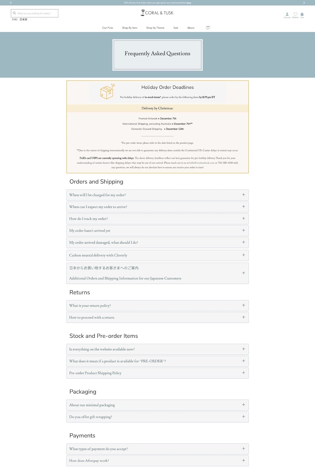
They’ve created clear categories and couched answers in handy accordions so as not to overwhelm visitors with text.
Beyond the typical questions, they’ve even included a question for their Japanese customers.
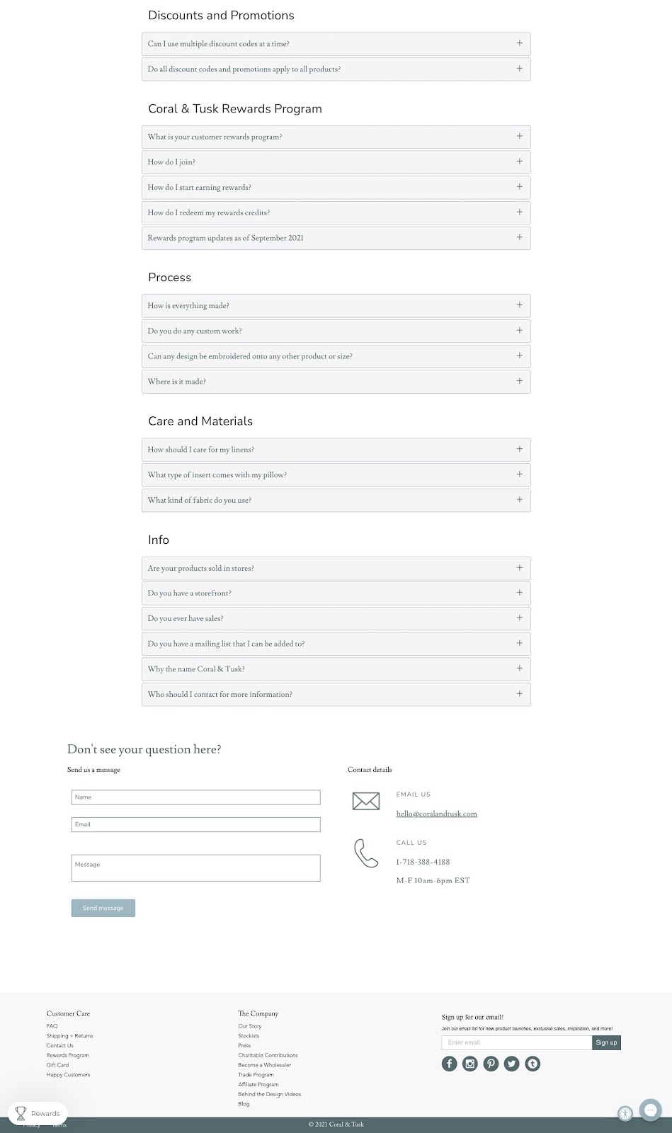
They wrap up the page with three options for contacting them if their extensive FAQ page didn’t address their question.
No doubt their influx of support questions is smaller than it could be if it weren’t for the great FAQ page.
Rumpl
This page from Rumpl is pretty simple but does the job.
Doing such a good job of describing their innovative “sleeping bag blankets” throughout their product pages, their FAQ page doesn’t have to do as much work.
They start the page off with a simple lifestyle photo of their product in action, a simple on-brand design choice.
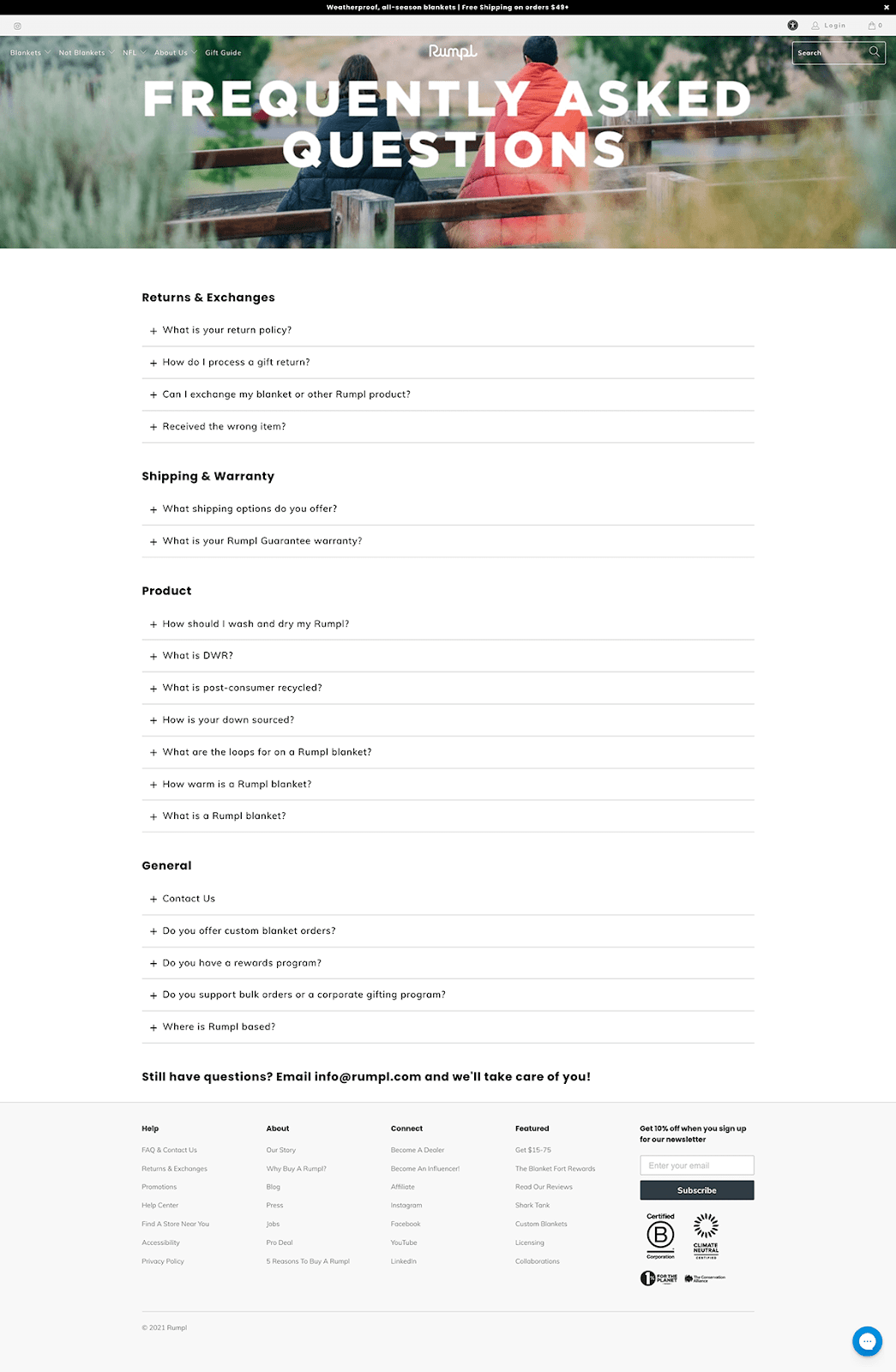
Using great categorization and collapsible accordions, answers are easy to find and easy to hide. They also utilize internal linking to pages that can answer certain questions more fully, particularly for product-related questions.
This page also serves as their Contact Us page, dedicating a whole question to the various emails you can use to get in touch.
Buddy & Lola
You don’t see a lot of FAQ pages that are as lively and fun as this one from Buddy and Lola.
As a dog supplement brand, their questions are almost completely centered around canine health and product effectiveness.
The visual addition of a questioning dog livens up the page with a brand-aligned aesthetic.
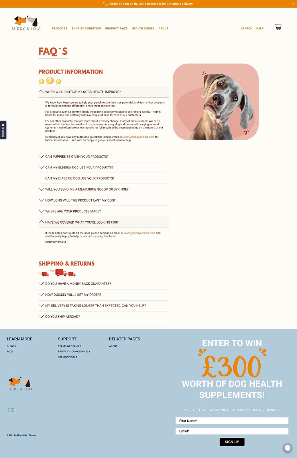
They answer the most important questions while keeping the page fairly short.
The last question in the first section invites visitors to contact them if they still have questions, allowing them to support the customer without going too long with questions.
instead
This FAQ page from natural fertilizer subscription service instead is extensive yet easy to peruse.
The design is simple but very brand-aligned with the subtle grassy header image.
The brand comes through in the copy as well, with conversational answers that are fun and sound like they come from a friend.
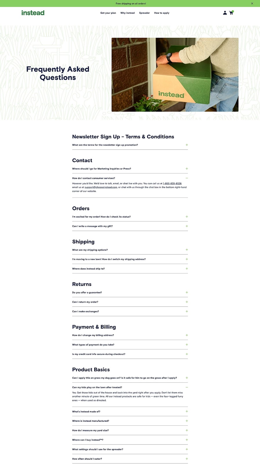
For instance, for a question about if it’s safe for dogs after applying the fertilizer, they say:
“We’ve always got dogs on our mind, but especially when we created instead. As soon as you apply, let your dog have his yard back, he’s probably got all kinds of business to get to out there.”
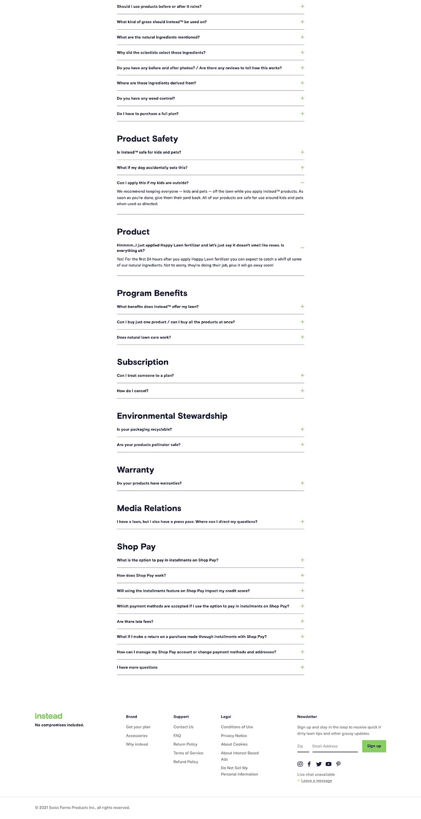
Finally, while the page is quite long, it has clear categories so that you can find exactly what you are looking for and ignore the rest. It acts as an effective question library.
#cta-visual-pb#<cta-title>Your FAQ page could look this good<cta-title>Try Shogun for free and start building out your perfect store to create a totally unique customer experience.Start building for free
Harlem Candle Company
Simplicity reigns in this FAQ page from Harlem Candle Company.
They only have a handful of questions but have built a structure that can handle a lot more as they grow.
With categories breaking up the questions, accordions that expand to reveal answers, and a scrolling table of contents along the side, they’ll be able to add as many questions as they need while maintaining the simple design.
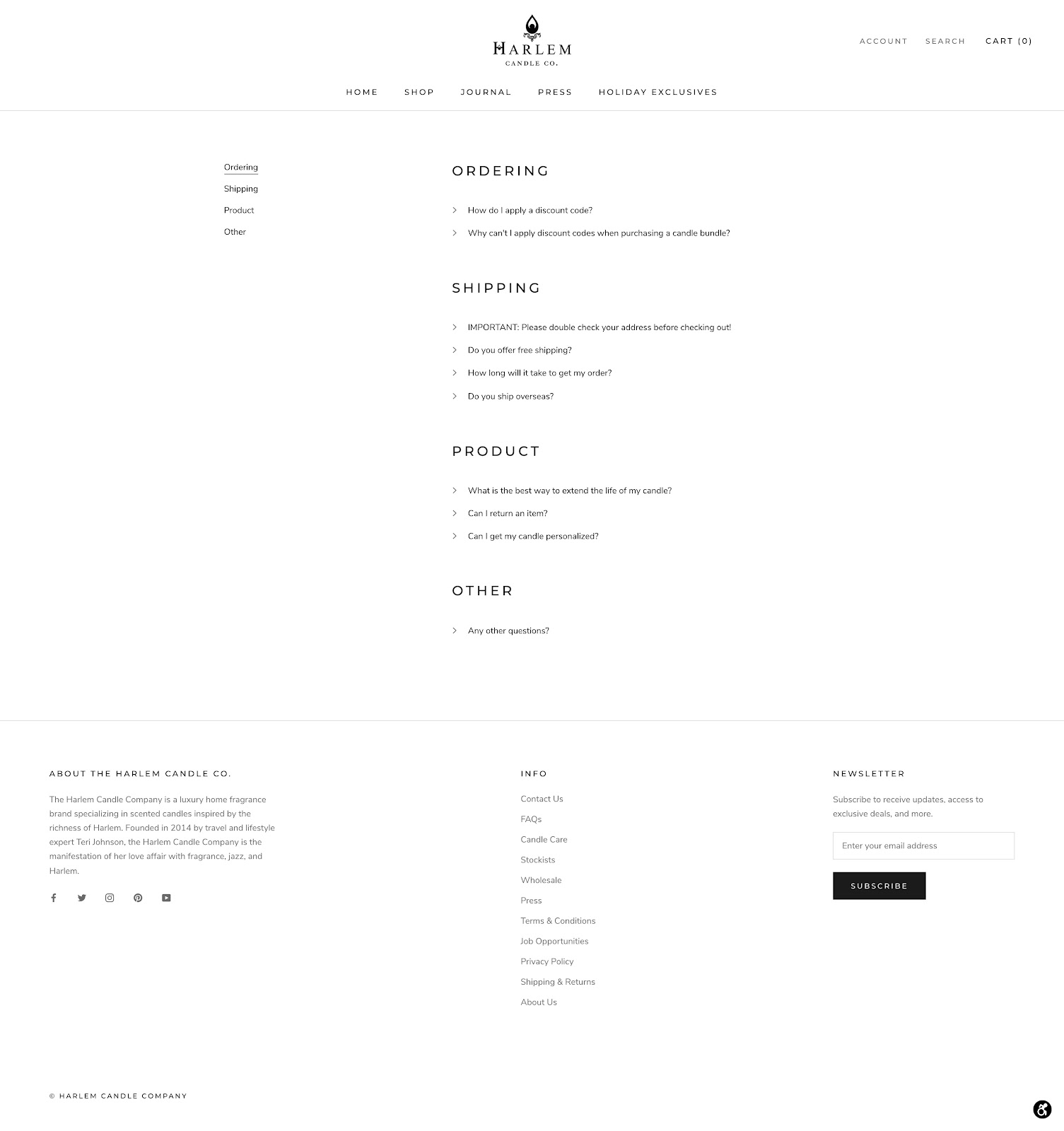
They wrap it up with how to contact them with any other questions.
As their customer support collects more common questions, they can add them to this page to improve their customer experience.
SNOW
Another quite long FAQ page, this time from SNOW, a brand that sells teeth whitening products.
The questions aren’t split up like many FAQ pages, but rather by product type. For visitors who are interested in or have purchased a particular product, they can easily find all questions in one section.
Even before you encounter the questions, they include a CTA for a quiz to find out what product is best for you.
The accordions contain a ton of valuable information, not only in the form of detailed textual answers but also demonstration videos that do a great job of answering particular questions.
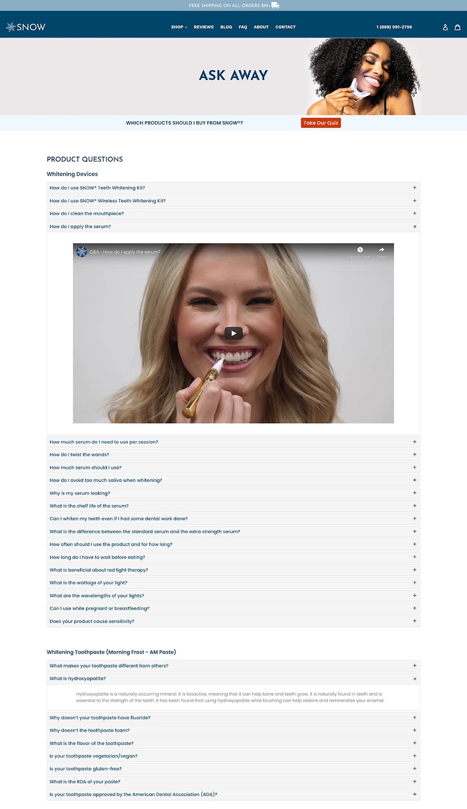
From their vast number of questions, they have likely done a lot of customer research to build out this page. The answer to your question is probably here!
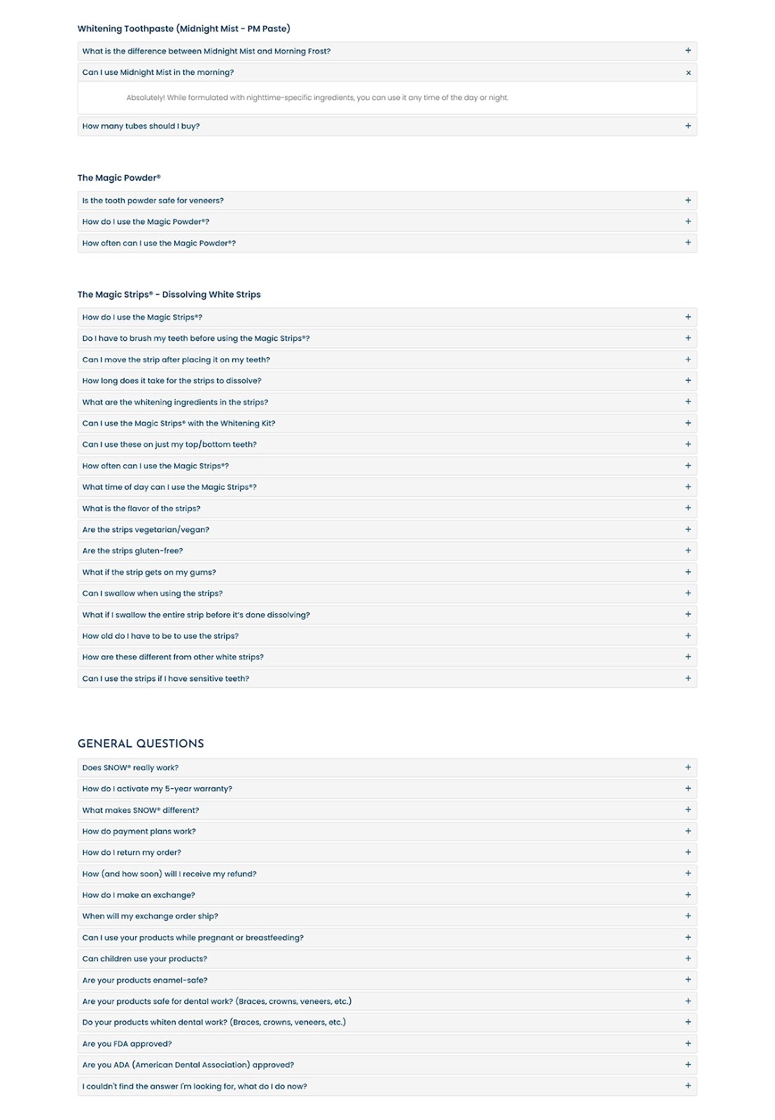
They go beyond just answering questions on this page. It also serves to drive sales.
They round out the page with some powerful customer reviews, a best sellers featured collection, a video of their product on Ellen, and an email capture form.
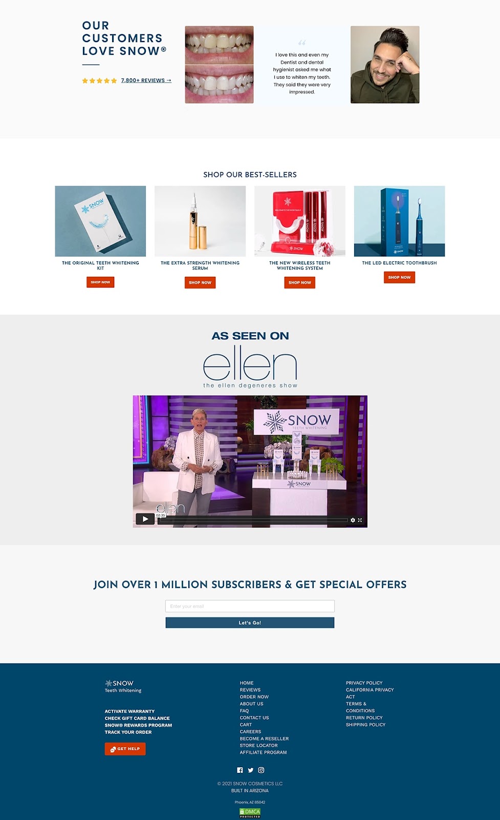
It goes to show that a FAQ page doesn’t have to have just one job.
Sheertex
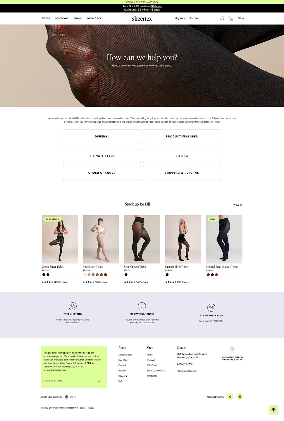
This one from tights brand Sheertex is different from any that we’ve covered here.
Their main FAQ page doesn’t actually answer any questions but serves as an intersection for the different FAQ categories—General, Product Features, Sizing & Style, Billing, Order Changes, Shipping & Returns.
By doing this, they can include all the questions they want to answer without creating a single super long page that could overwhelm their visitors.
Despite being a simple page, they don’t miss the chance to drive visitors to their product and collection pages with a selection of products and their top benefits.
When you click into a category, you get the questions neatly lined up and themselves categorized. Click the plus icon to expand the answer hidden in the accordion.
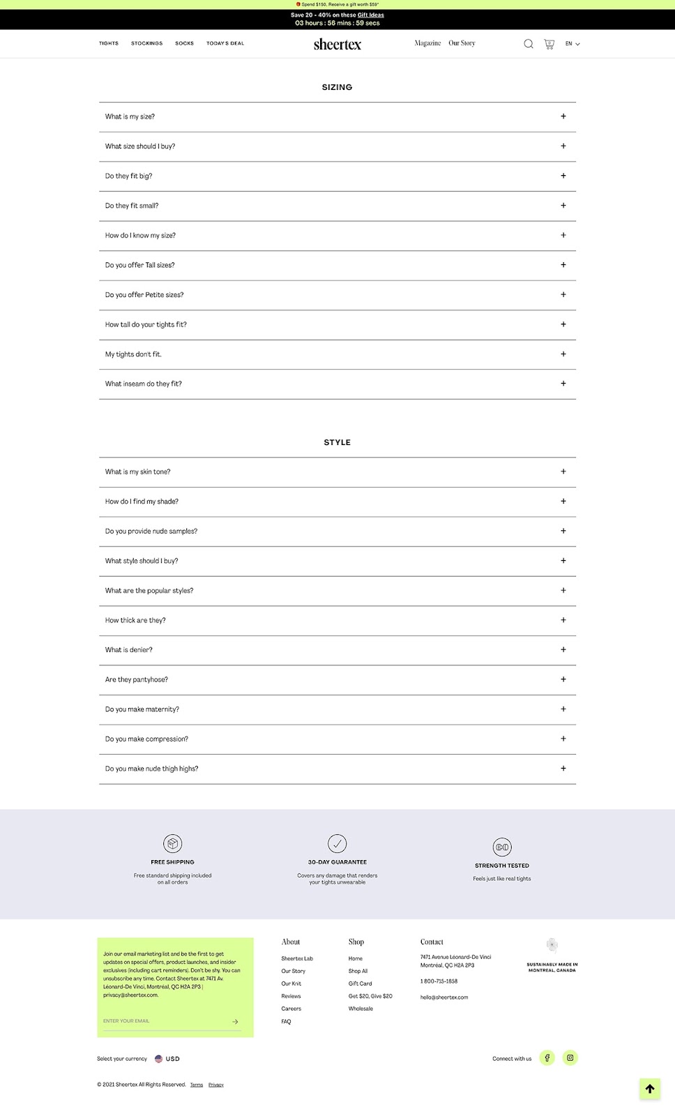
Beyond the better customer experience created by splitting up the major categories, it also allows for more ranking opportunities on search engines for the long tail queries.
With a form built into their footer, every page includes an email capture opportunity.
FAQs about FAQ pages!
How often should I update my FAQ page?
To ensure that your customers have the most up-to-date information, you should update your FAQ page regularly. This could range from monthly to quarterly depending on how often your products change or questions arise.
What elements should I include in my FAQ page?
An effective FAQ page should include a clear and concise introduction, questions and answers divided by categories, links to additional resources, and a search function to help visitors quickly find the answers they are looking for.
What are the benefits of an ecommerce FAQ page?
An ecommerce FAQ page can help streamline customer service inquiries, provide helpful resources for customers, and reduce friction in the buying process.
Should I include a search function on my FAQ page?
Absolutely. A search function can be a game-changer, allowing visitors to quickly find the information they’re seeking without having to scroll through endless questions.
How can an FAQ page improve my SEO?
An FAQ page can improve your SEO by providing valuable content that answers common queries related to your industry or product. This can increase your page’s visibility on search engines and drive more organic traffic to your site.
How can I measure the effectiveness of my FAQ page?
You can measure the effectiveness of your FAQ page by tracking metrics like page views, time spent on the page, and click-through rates for any links included. This data can help you understand how well the page is performing and where improvements can be made.
How should I prioritize the questions on my FAQ page?
Prioritize questions based on their relevance and frequency. The most commonly asked questions should be at the top, making it easier for visitors to find what they’re looking for.
Create more impressive FAQ pages for happier customers
Obviously, there are many ways to do a FAQ page right.
You can go long or keep it short. You can stick to answering questions or add in conversion optimizing elements. You can go with a simple design or make it splashy.
However you do it, you should prioritize adding a FAQ page to your store. The success or failure of your ecommerce business depends on the customer, so you need to center their experience on your store.
By answering their questions, you can build trust, reduce support tickets, and drive sales. With these examples as guides, you are certain to build something great.
#cta-visual-pb#<cta-title>Start building a better FAQ page<cta-title>Create a totally custom FAQ page in just a few clicks using the Shogun Page Builder—completely code-free and aided by AI.Start building for free

Sean Flannigan
Sean is one of Shogun's tireless content marketers. When he isn't creating exciting ecommerce content, he's probably biking or at the park.

